Wordmarks
Various clients
Examples of identities which primarily use a typemark/wordmark. Each one shows a care and appreciation of typographic detailing.
famille began as a family-run agency of marketing obsessives, with know-how honed from decades of experience in strategy, content creation, UX and more. Their approach is built around genuine, close collaboration — working alongside customers. Hence the tagline: Together, we click. Once we settled on an appropriate typeface for the wordmark, I extended the ascender (top of the letter) on the ‘f’, to gently embrace the following letters.
two&two press is an independent photobook publisher founded in 2019 by Marc Wilson and Anna Nekrasova-Wilson. Sometimes a simple solution is required, as here with an understated, quiet wordmark. The challenge was to find the perfect ampersand, and the rest followed.
Sometimes, especially with a complex wordmark, you just need to tweak the kerning to force a pleasing alignment of letters. Società Agricola Ferrarini is one such case, where a stacked version of the wordmark aligns perfectly through the letter A.
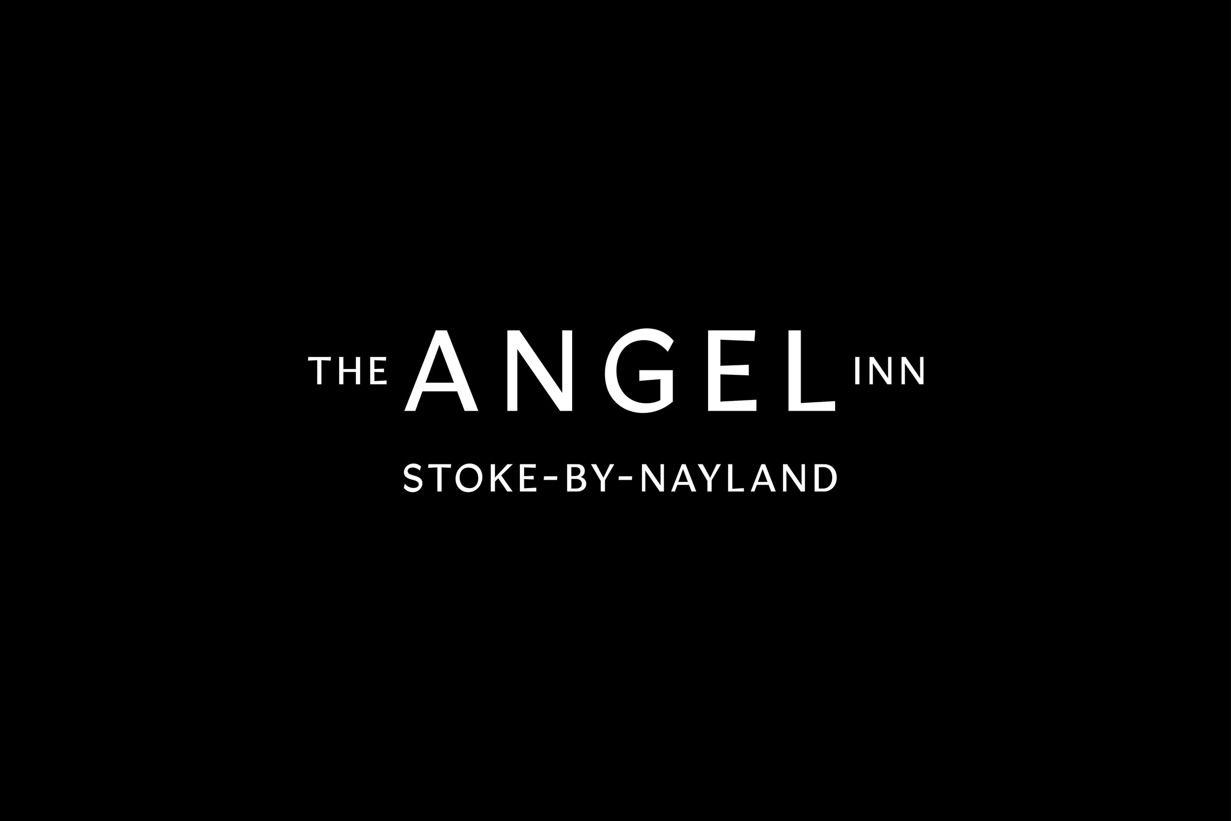
Work on developing The Angel Inn identity is covered here. All I’ll add is that I was keen to give the dominant word some small angel wings through the words ‘THE’ and ‘INN’.
Aside from being a good friend, Kelvin Rogers is a cracking photographer. This thoughtful and humble man now has an appropriately understated wordmark, albeit with a slight embellishment of the letter ‘n’ to hint at his creative side (some typefaces have alternative options for some letters, as with the ‘n’ here). The long em dash gives ‘kelvin’ a gentle nudge forward, if nothing else, to allow the ‘e’ in both names to align.
Alconbury Weald (the place) and Make|Grow (the idea) were typeset in ARS Maquette, a confident, clean and stylishly simple typeface. The openness of the letterforms are further enhanced by stylistic alternatives, such as the open letter ‘a’ and friendly swashes on the ‘l’ and ‘y’. The final image shows the Incubator building with Make|Grow writ large, adding pressure to get the kerning spot on.


